An effective landing page (funnel page) or squeeze page is the foundation of successful marketing on the net. Your offer could be enticing and your PPC ads might be perfect, but your efforts will suffer without a good landing page. The layout of your squeeze page should be flawless. A persuasive page draws the attention of targeted visitors and induces them to complete a conversion. However, the key issue is what makes an effective landing page. If you need detailed info in this respect, read below.
Clean, structured design
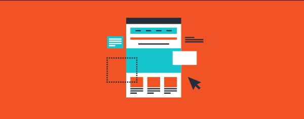
The feel, look, and overall structure of the page design will have a great impact on the effectiveness of your squeeze page. The primary aim of your funnel page should be to convert visitors into customers or prospects. So it’s extremely important that all elements of the page work coherently towards the conversion objective.
Whether it’s signing up for a newsletter, filling out a form, downloading an eBook or making a purchase, your page design should attract visitors’ attention through colorful and eye-catchy images. Most importantly, make certain that there’s a strong contrast between the background and button color. That will highlight the key element and drive visitors to the conversion step.
Be a minimalist
Maintain a clean, clutter-free page with a simple, user-friendly navigation without distractions. If visitors feel uneasy to navigate, they’ll move away. Consequently, you’ll have a higher bounce rate, which will defeat the very purpose of your landing page. Your funnel page should present all the necessary info needed to motivate visitors to take the required conversion action, but nothing extra.
Too much information could overwhelm visitors. So keep it minimal and provide only the necessary info that steers visitors down the funnel. An intriguing page design sustains a clean, attractive impression while providing visitors the information they desire in a non-intrusive way that leads to the final step of conversion.
Highlight the offer value with a header
A great landing page ought to have a strong offer. Also, it should explain why the offer is valuable in clear, concise terms. In this respect, the headline and subheadings of your funnel page play an important part. They extend a key opportunity to promote the value of the offer.
For example, if you intend to motivate visitors to download an eBook on Twitter marketing, you may highlight your offer with the headline – Free Twitter Marketing eBook or Get Tons of Targeted Twitter Followers Fast. Such a headline adds a value proposition to the offer. Remember, you’ve about 10 seconds to convince users that your offer is worth. So take time to make your offer and value proposition clear and convincing.
Keep the form short
When users visit your funnel page, your aim is to collect as much data as possible. However, a good landing page should get more information in a compact manner. You should make users to fill out a few form fields. If the form is lengthy, visitors won’t complete it.
A good funnel page should mainly seek the name and email address of visitors. Asking for additional information such as phone numbers and/or birth date will deter users from completing the form. So be mindful of this important point when creating your form. Also, make the form colorful to encourage even an undecided visitor to provide his details.
Bottom line
Building a conversion-oriented funnel page is imperative in order to achieve your conversion and sales targets. Just educate yourself on what makes an effective landing page as explained above. With handy information by your side, creating intriguing landing pages that actually covert becomes easy and effortless.
Need software to do all this as quickly and easily as possible? Take a look at bestlandingpages.software.










Comments